My finished band T-shirt.

Posted: January 8, 2012 in Uncategorized
Tags: , ,

My T-shirt was based on the song “welcome to the jungle” by Guns N Roses. It features the words “welcome to the jungle” across the chest, my actual handprint (rings and all!) and the words “i love Slash” on the back and some little doodles related to the story of the song. e.g. dice – gambling and pills – drugs.

ImageImageImage

ImageA picture of me in the T-shirt to show the effect of the rip and safety pinned section at the top. I like how the T-shirt is crinkled (from being in my bag) because if you think about it, during the Punk era, they would’nt have thought “oh hang on a minute… let my whip out my iron and do my creases!” would they?

To make my T-shirt i used my hands, some safety pins and lots of fabric pens.


ImageThis is the over all view, it could have been better but with limited resourses available and an impending dead line, its the best i could do.

ImageThe eye.The center focus. I see it as a third eye, inkeeping with the mellow theme to the image. I used loads of water with this section to give it a tie-dyed effect, when held under light it looks wonderfully phsychedelic!

ImageMy favourite bit of my image. It looks very groovy. I think one of the factors that helped me achieve the effects i have is actually listening to the music while painting. I was listening to Janis at the time, the song “ball and chain”. I see music as a great aid to my art (no rubbish jokes there please!).


The Queen of psychedelic soul …  Janis Joplin, What can you say about Janis? She was an iconic blues/rock figure of the Hippie era. Unfortunately, she died in October 1970, aged only 27.

Box of pearls was released in 1993 and is a collection of all of Janis’ songs and her only no.1 hit, Me and Bobby McGee. Unfortunately, i cannot find who designed the actual cover but i think its just such an awesome image to replicate that i must do it!

As soon as i have done my own cover, i shall upload it…

This slideshow requires JavaScript.

These images are of my own artwork in response to my earlier post containing images of a very interesting album cover. I quite like this particular piece because it reminds me of an old fashioned circus, with orange and red tones and the whole concept of the knife throwing act. I chose to draw a werewolf type figure because on the original album cover it was a cats head on a human body and i wanted to tweak it in a subtle but noticable way! My favourite thing about this painting is the fact that i used differnt medias like water colour paints, acrylic paints and chalks. To hold the chalk in place and considerably reduce smudging on the finished piece, i also sprayed it generously with hairspray! Next i would say i like the way i drew the dogs head in a fierce and rustic cartoon style. However, there are negative points to every piece of art. in my case i didnt like how my knife throwers board wasnt completely circular and that the on the Figure (that i have named Caeser!) the shins and feet arent visble or the fact that his fur wasnt really textured enough.

Artwork:

The booklet for Nine Lives contains 12 pieces of album art (including the cover). Each picture contains a smaller version of the previous picture within itself. The final picture is included in the first, creating an infinite loop. It was designed by Stefan Sagmeister.

Controversy:

The original artwork angered some Hindus, who felt the artwork (taken from Hindu imagery and altered by giving the dancing figure a cat’s head) was offensive. The image depicts Lord Krishna (with a cats head) dancing on the head of the snake demon, Kaliya, a popular episode from Stefans Sagmeisters childhood. The band had been unaware of the source of this artwork and apologised, replacing it with a revised version.

Soon, i will be uploading my own album cover inspired by this.

This slideshow requires JavaScript.

Jamie Reid………. What a guy!

Posted: October 14, 2011 in Write Ups

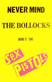
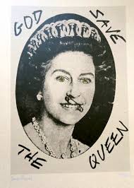
(born 1947) is a British artist and anarchist with connections to the situationists. His work, featuring letters cut from newspaper headlines in the style of a ransom note, came close to defining the image of punk rock, particularly in the UK. His best known works include the Sex Pistols album Never mind the bollocks, heres the Sex Pistols and the singles “Anarchy in the UK”, “God save the Queen” based on a Cecil Beaton photograph of Queen Elizabeth the second, with an added safety pin through her nose and swastikas in her eyes, described by Sean O’Hagan of The Observer as “the single most iconic image of the punk era”),”Pretty Vacant” and “Holidays in the sun”.


Reid’s design for the Sex Pistols’ “Anarchy in the UK.” poster—a ripped and safety-pinned Union Flag—is regarded as the pivotal work in establishing a distinctive Punk Visual Asthetic.


He was educated at John Ruskin Grammar School in Croyden. With Malcolm McLaren, he took part in a Sit in at Croydon Art School.

Reid produced a series of screen prints in 1997, the twentieth anniversary of the birth of punk rock. Reid has also produced artwork for the World Music fusion band Afro Celt sound system.


Jamie Reid created the ransom-note look used with the Sex Pistols graphics while he was designing Suburban Press, a radical political magazine he ran for five years.


His exhibitions include Peace is Tough at The Arches in Glasgow, and at the Microzine Gallery in Liverpool, where he now lives. Since 2004, Reid has been exhibiting and publishing prints with the Aquarium Gallery, where a career retrospective, May Day, May Day, was held in May 2007.He now exhibits and publishes work at Steve Lowe’s new project space the L-13 Light industrial workshop in Clerkenwell, London. He is also represented by Isis Gallery who look after Reid’s extensive archive.

Reid has also been involved in Direct action campaigns on issues including the poll tax, Clause 28 and the Criminal justice bill.

His former partner was the actress Margi Clarke, with whom he had a daughter, Rowan.

        !!!!!!!!!!!!!!!!!!!    !!!!!!!!!!!!!!!!!!!!!!!!

good sites for jamie reid: http://www.jamiereid.org/

http://en.wikipedia.org/wiki/Jamie_Reid

http://www.opus-art.com/artists/JamieReid

Album Cover Response

Posted: September 28, 2011 in Write Ups

This is my album cover response in the style of Peter Blake. I chose all these people because i think they are either gorgeous, handsome, clever, iconic or important or perhaps even just cool (in the case of Animal, Gok Wan and Einstein!) I put it against a red background because i think red is a very emotive colour and the colour of love. The flames in the background are for obvious reasons …. my choice of people are hot. Flames also link into passion i.e “fiery passion”. I like how i have Johnny Depp swinging through the centre of my picture just like he did in the film Benny and Joon.

Peter Blake, Life and work.

Posted: September 28, 2011 in Write Ups

          Peter Blake

Sir Peter Thomas Blake, CBE, RDI, (born 25 June 1932, in Dartford, Kent) is an English pop artist, best known for his design of the sleeve for the Beatles’ album Sgt. Pepper’s Lonely Hearts Club Band. Being an avid fan of the team, he has also designed an exclusive collage for Chelsea Football Club for the 2010 season. He lives in Chiswick, London, UK.


During the late 1950s, Blake became one of the best known British pop artists. His paintings from this time included imagery from advertisements, music hall entertainment, and wrestlers, often including collaged elements. Blake was included in group exhibitions at the Institute of Contemporary Arts and had his first solo exhibition in 1960. It was with the ‘Young Contemporaries’ exhibition of 1961 where he was exhibited alongside David Hockney and R.B. Kitaj that he was first identified with the emerging British Pop Art movement. Blake won the (1961) John Moores junior award for his work Self Portrait with Badges. He first came to wider public attention when, along with Pauline Boty, Derek Boshier and Peter Phillips, he was featured in Ken Russell’s Monitor film on pop art, Pop Goes the Easel, which was broadcast on BBC television in 1962. From 1963 Blake was represented by Robert Fraser which placed him at the centre of swinging London and brought him into contact with leading figures of popular culture.           


On the Balcony (1955-57) is a significant early work and still stands as one of the iconic pieces of British Pop Art, showing Blake’s interest in combining images from pop culture with fine art. The work, which appears to be a collage but is in fact wholly painted, shows, among other things, a boy on the left of the composition holding Edouard Manet’s The Balcony, badges and magazines. It was inspired by a painting by Honoré Sharrer depicting workers holding famous paintings.


Blake also painted several notable album sleeves. He designed the sleeve for Sgt. Pepper’s Lonely Hearts Club Band with his then-wife Jann Haworth, the American-born artist whom he married in 1963 and divorced in 1979. The Sgt. Pepper’s sleeve has become an iconic work of pop art, much imitated and Blake’s best known work. Producing the collage necessitated the construction of a set with cut-out photographs and objects, such as flowers, centred around a drum (sold in auction in 2008) with the title of the album. Blake has subsequently complained about the one-off fee he received for the design (£200), with no subsequent royalties. Blake also made sleeves for the Band Aid single, “Do They Know It’s Christmas?” (1984), Paul Weller’s Stanley Road (1995) and the Ian Dury tribute album Brand New Boots and Panties (2001; Blake had been Dury’s tutor at the Royal College of Art in the mid-60s). He also designed the sleeves for Pentangle’s Sweet Child and The Who’s Face Dances (1981), which features portraits of the band by a number of artists.      


good sites for researching peter blake: http://en.wikipedia.org/wiki/Peter_Blake_(artist)

http://www.tate.org.uk/servlet/ArtistWorks?cgroupid=999999961&artistid=763&page=1


This album cover is a very iconic one as far as album covers go. It has many different aspects to it as some of it is in 3D and the rest is in a kind of collage form. It centres around the drum cover with the album title on, this could represent the “impact” that the Beatles wanted to have on society. Stood behind the drum cover is a crowd of important and iconic historical and present day idols, some dead and some alive. I think this means that you can still stay on in spirit even after you’ve passed over. They are stood behind The Beatles in such a way that they look like a kind of army – poised and ready to defend! The crowd is stood against a beautiful blue sky representing a kind of calm after the storm, the storm being the two world wars, years and years previously. There are some smaller figures towards the front of the image that i think are publicity celebs from the time, like telly ads etc. Last but not least to discuss there is the small matter of the 3D flowers in the very front of the image. These look not unlike funeral flowers! i think they could represent the death of good music and the Beatles coming along to revive it! Also, the beatles were’nt too long after the Hippie phase of the sixties and some were still around so these flowers could be there in a tribute to the wonderful Hippie saying “Flower Power”.


Strangely enough, one of my chosen bands for my band assignment Def Leppard, just happened to have done a rather good homage to the Sgt.Peppers Album. It has a similar setup to the original, featuring the crowd and the 3D work with the red curtain. I decided to add this just to reiterate how iconic the original was. Note how the iconic figures have been moderned up a bit, adding figures such as Tutenkhamun, The Statue of Liberty, other band members similar to Def leppard, American Showgirls and what appears to be a blow up doll!

Band T-Shirts!!

Posted: September 21, 2011 in Uncategorized

The following T-shirts are mostly my own and were bought at concerts, well in the exception of the Bob Marley of course!! I thought it would go nicely with my other band assignment work.

This slideshow requires JavaScript.